Reimagining the In-Vehicle Experience
UX Research & Interaction Design · Automotive · 2026
NDA note: Details, visuals, and findings in this case study have been generalized or recreated to respect a confidentiality agreement.
At-a-Glance
| Client | General Motors |
|---|---|
| My Role |
|
| Team | 3 researchers and designers |
| Timeline | 3 months |
| Methods | Competitive and cross-industry analysis, ideation workshops, wireframing, usability testing, interactive prototyping, physical prototyping (3D printing) |
| Tools | Figma, ScreensStudio |
| Deliverables | Forward-looking UX concepts, high-fidelity interactive prototypes, physical interaction models |
Summary
Drivers need to complete tasks in seconds with their eyes on the road, yet in-vehicle systems keep adding features which draw the eye away from the road and towards the touch display. I helped a small team explore how interaction design could reduce cognitive load and make the driver and passenger experience feel more intuitive. By looking beyond the automotive industry for interaction models, we developed 3 concepts and validated them through user testing with both digital and 3D-printed physical prototypes. Final deliverables were presented to a group of several General Motors representatives to positive reception.
The Challenge
Vehicles are becoming more capable and more complex. Every new feature competes for the driver's attention, and the driver's attention is the one resource that can't be expanded.
How might we simplify complex interactions while keeping the experience clear, responsive, and usable as technology rapidly evolves?
The constraints made this hard:
• Low-attention environment: inputs must be quick, glanceable, and safe while driving.
• Multiple users: drivers and passengers have different needs and contexts.
• Fast-moving technology: designs had to hold up as capabilities change.
• Physical + digital: screens, controls, and spatial layout all shape the experience together.
My Role
I worked in a small, cross-functional team as a UX researcher and designer. My contributions included:
• Proposing key features, such as customizable physical controls
• Synthesizing research into guiding principles
• Designing 3 flows along with accompanying wireframes and prototyped screens
• Planning and facilitating user testing sessions
• Presenting concepts and incorporating feedback in client check-ins
Process
1. Research: looking beyond automotive
We began with a competitive analysis of in-vehicle systems. The goal went beyond cataloging features: we looked at what competitors weren't doing, and dug into why: technical limits, safety regulation, or missed opportunity.
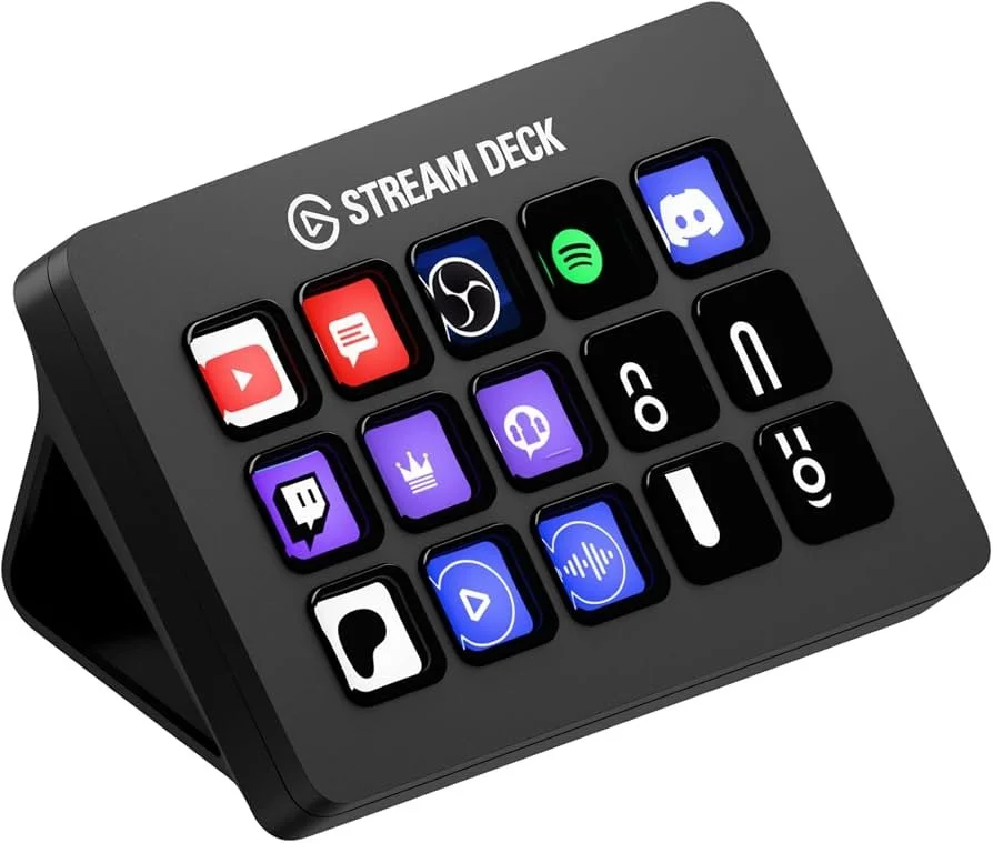
It became clear that studying only cars would keep our client in permanent catch-up mode, copying patterns that already exist (ie, in competitors such as Tesla, Rivian, and Xiaomi). I raised this with the team, and we agreed to widen the scope to non-automotive digital products and platforms. Initially we had focused on familiar interaction technology such as smartphones and tablets, but eventually I brought up the idea of taking inspiration from a road slightly less traveled: the Elgato Stream Deck.
Key insights
• Competitors currently focus on touch displays due to the flexibility offered, losing the reliability of tactile feedback from physical controls
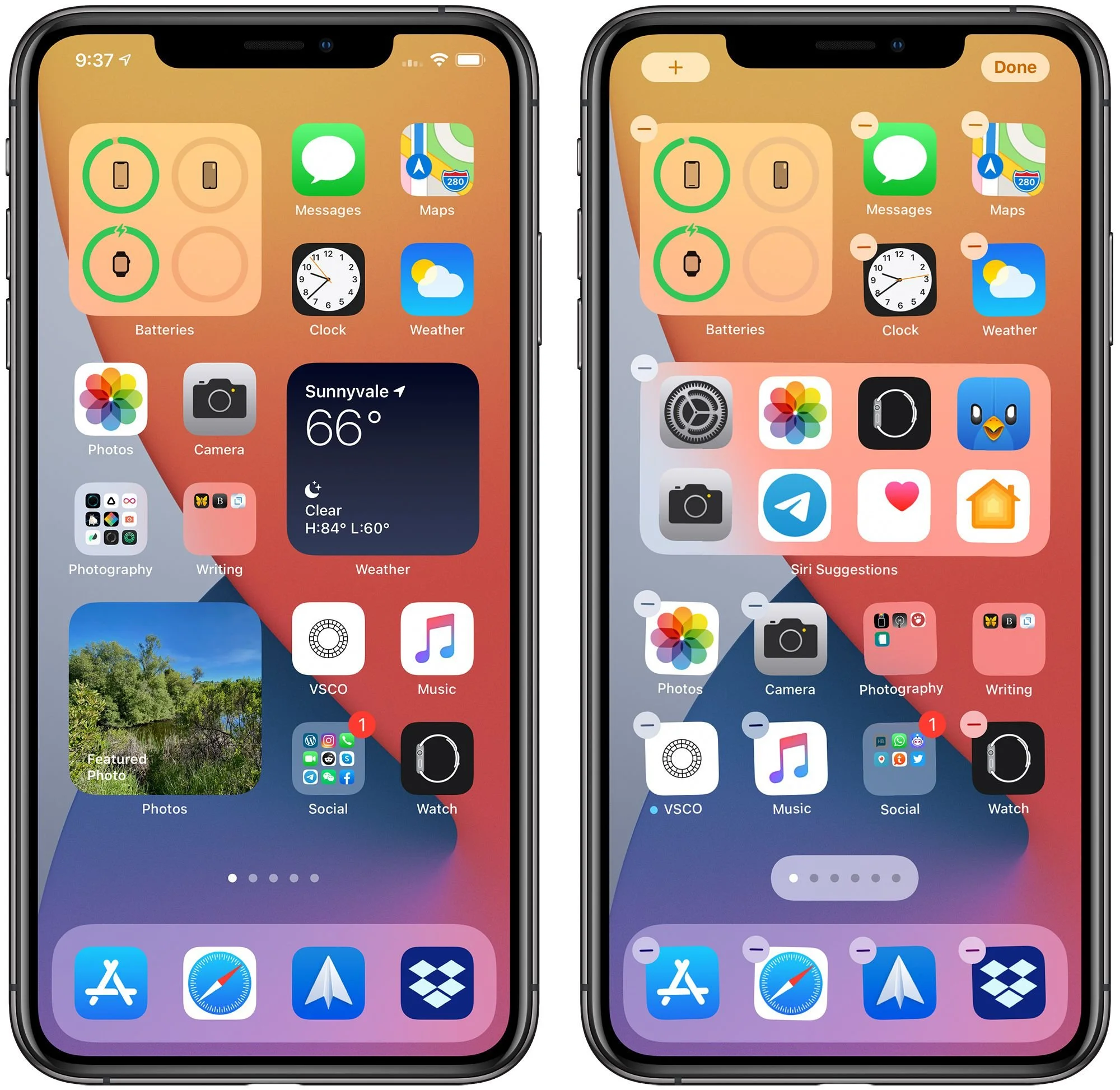
• Smart phones’ widgets and other customization options further this flexibility beyond what is currently offered in the automotive space
• The Elgato Stream Deck marries the customizability of smart phone widgets and the reliability of having muscle memory tied to physical buttons, along with the tactile feedback that comes with physical controls
2. Design Principles
We distilled our research into three principles that guided every decision:
Flexibility over fixed patterns. People have different preferences and contexts, so the system should support personalization rather than force one way of interacting.
Match existing habits. Low-attention moments call for interactions that feel familiar and need minimal thought.
Consistency across digital environments. Familiar patterns shorten the learning curve and make the system feel intuitive from the first use.
3. Ideation and Low-Fidelity Wireframes
We ran design sprints and brainstorming sessions to generate a wide range of ideas, then converged on a set of low-fidelity wireframes organized around a customizable home-screen experience.
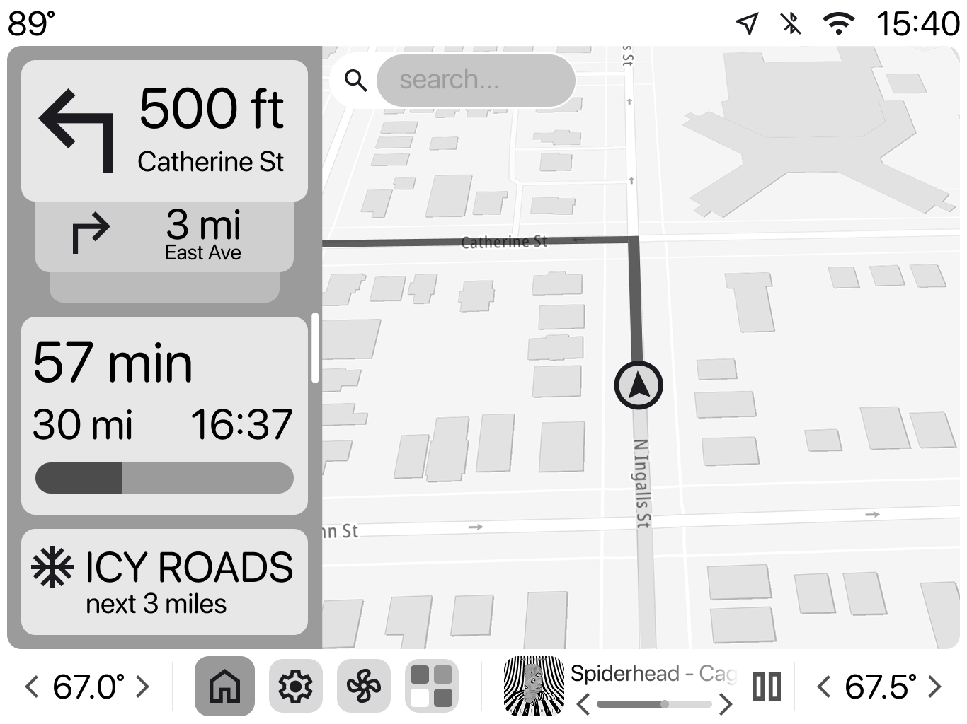
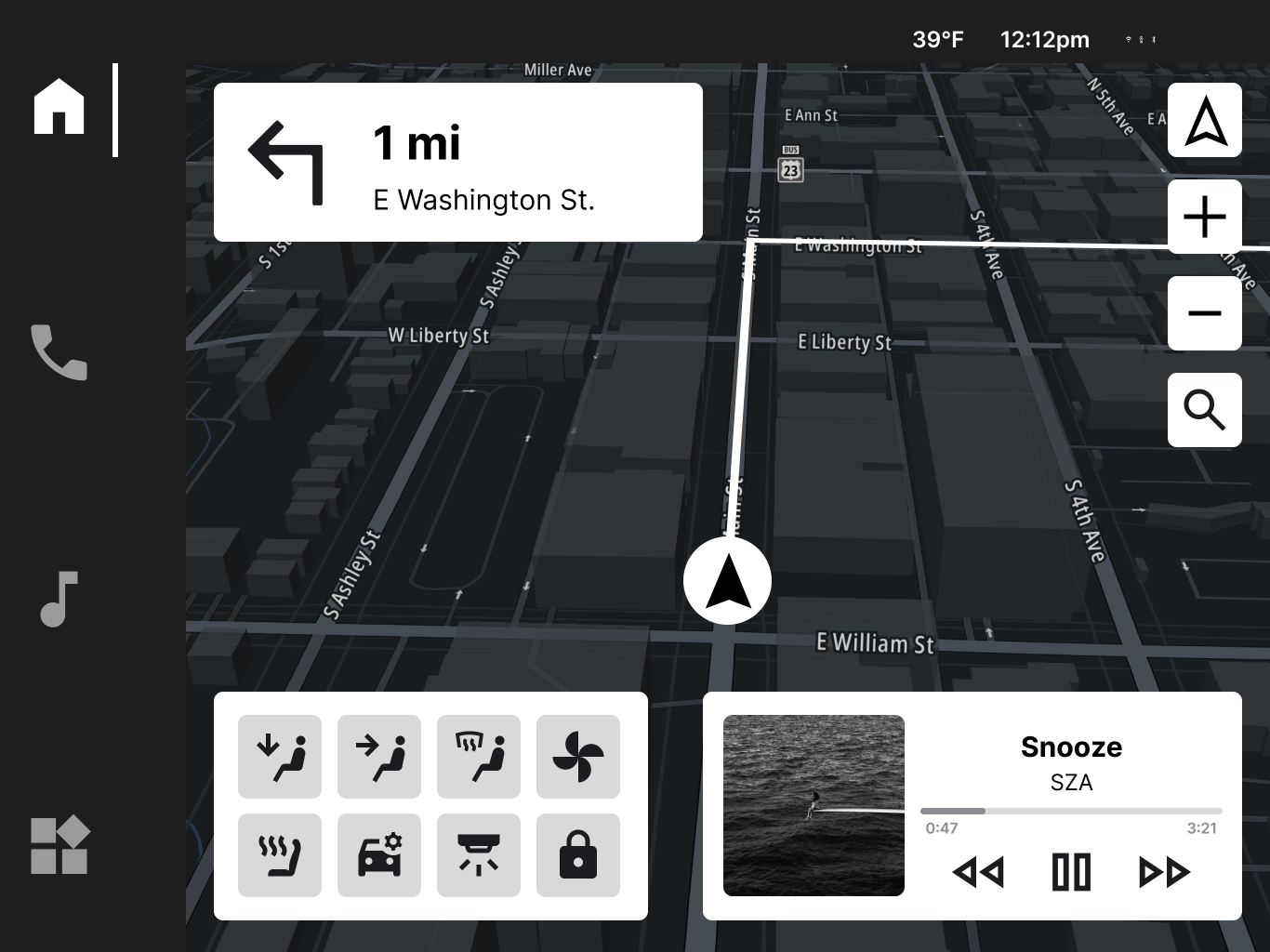
Initial sketches and planning were focused on content layout and the locations of various elements. This stage eventually led to the creation of two different wireframes, pictured above in greyscale. As the team went back and forth between the two wireframes, ultimately it was decided that a mixture of the two would be best: the familiar top-to-bottom visual hierarchy of the wireframe on the left, along with the widget-style customizability of the wireframe on the right.
4. Testing and Iteration
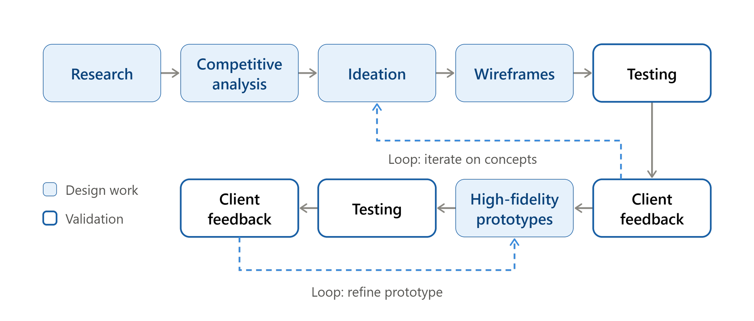
We tested our concepts with 4 participants using task-based testing. We measured task time, error-rate, and perceived effort, along with asking participants to describe their thought processes as they conducted their tasks.
Key Findings:
Some touch targets were too small, leading to difficulty in navigating between and within screens.
Aspects of our vehicle modes and profiles were opaque to testers, in particular the iconography and differentiation between the two.
Certain icons were difficult to parse.
Changes:
Touch targets were increased in size, along with an increase in size across the board for font, icons, buttons, etc.
Vehicle modes were more clearly labeled, and the less-important driver profile features were placed behind a settings menu to avoid confusion for first-time users while allowing more experienced users to get more out of their vehicle.
Icons were unified within a style guide, and were audited to ensure the icons used aligned with common convention.
5. Stakeholder Collaboration
We held regular check-ins with the client to present progress and new concepts, then folded their feedback into each round. This kept our work aligned across three fronts: user needs, technical feasibility, and product goals.
Though I cannot divulge any details regarding what was said during our meetings with GM representatives, one high-level piece of advice we did receive was to mind the scope of our work. Since we were not only ideating on and implementing working prototypes of innovative features, as well as creating a design system from the ground-up, we needed to focus on what was most and least important, and trim the fat so we could polish our most important concepts.
6. Physical Prototyping
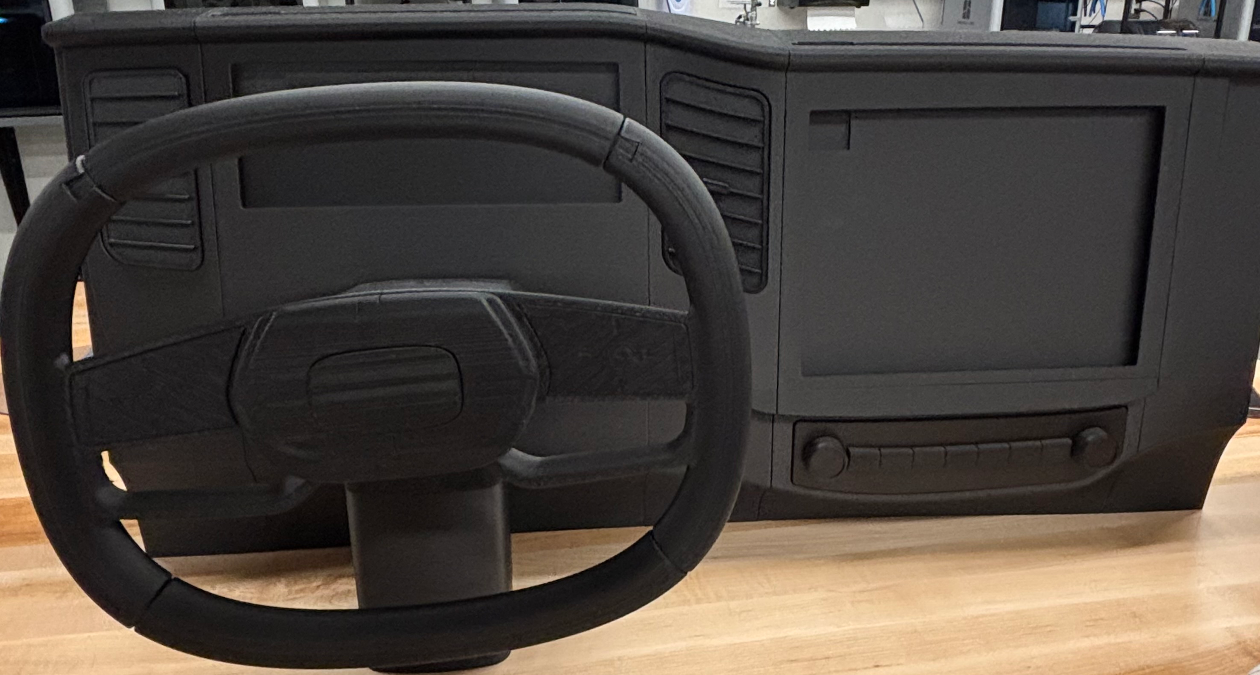
In a vehicle, interaction happens in space as much as on screen. We used 3D-printed components to simulate physical touchpoints and test their position, reach, and feel alongside the digital prototype.
This revealed issues a screen-only prototype would have missed, such as display elements on the cluster being obscured by the steering wheel. We fixed these before the concepts reached the high-fidelity stage.
The Solution
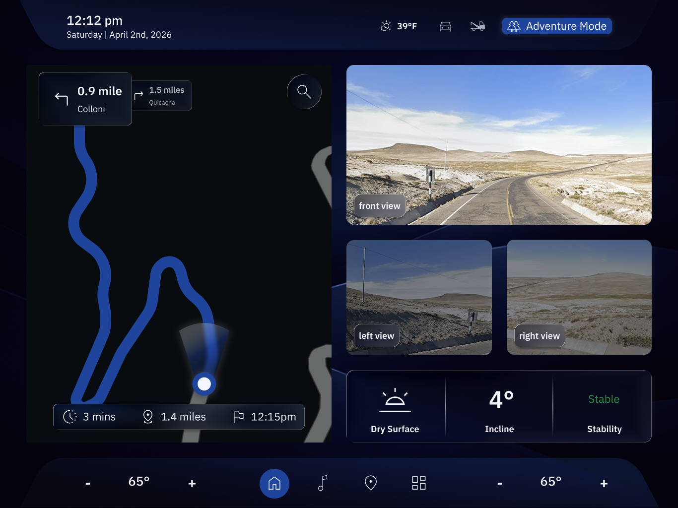
The final output was a set of forward-looking concepts and interactive prototypes. While I cannot share our final deliverables, I can briefly go over high-level concepts which ultimately shaped our final prototype.
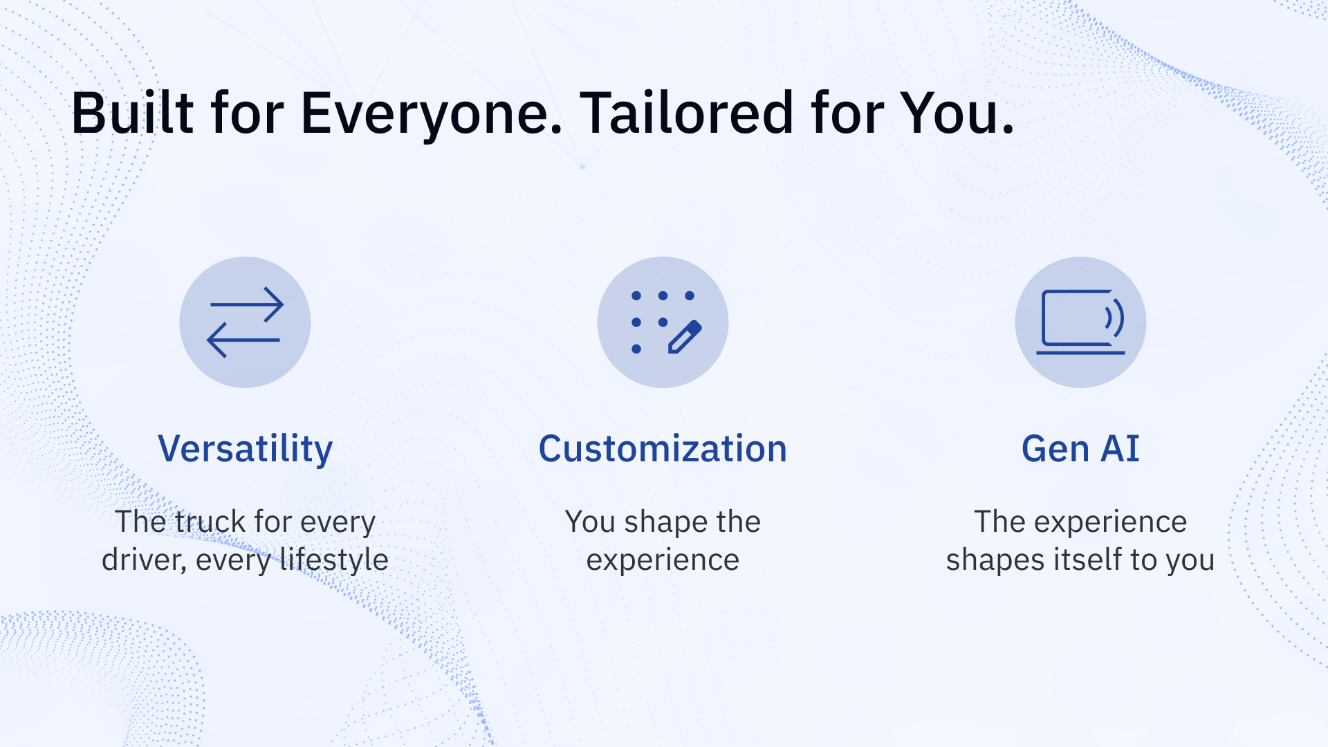
Ultimately, our focus was on personalization - how the experience caters itself to the user, customization - how the user tailors their experience to their own needs, and the marriage between the two. This was manifested primarily by utilizing generative AI, on-screen widget-style customization for simple plug-and-play adaptability, and physical controls which could be customized via digital menus.
Impact
Validated Approach - User tests showed positive feedback towards our key concepts across all 4 tests.
Client Response - Concepts were pitched to a room of GM stakeholders to very positive reception.
Methodological Value - Cross-industry research gave the client new interaction territory beyond competitor benchmarking.
Process Value - Combining digital and physical prototyping caught issues earlier and gave stakeholders something tangible to react to.
Reflection
What I learned:
Look outside your industry. Inspiration from other fields helps you lead instead of follow. If we’d only looked towards Rivian and Tesla, we’d constantly be playing catch-up with our direct competitors. By looking beyond automotive, I was able to use Elgato’s Stream Deck as inspiration for one of our key features.
Alignment is a design skill. In complex systems, regular stakeholder check-ins kept ideas feasible and the work moving.
Design for the physical world. Digital and tactile thinking must be developed together. Screens alone don't capture how people actually reach, glance, and touch.
Looking back helps you move forward. Familiar patterns and existing habits are often the best foundation for something new.