Maker Works: Turning Website Visitors into In-Person Makers
UX Research & Design, Project Management · Local Maker Space · 2025
At-a-Glance
| Client | Maker Works |
|---|---|
| My Role |
|
| Team | 5 person cross-functional team (1 project manager, 4 researchers) |
| Timeline | 3 months |
| Responsibilities | Research planning and synthesis, deadline and deliverable management, weekly client meetings, stakeholder alignment, research contribution |
| Methods | User interviews, interaction mapping, heuristic evaluation, competitive analysis, usability testing, affinity mapping |
| Tools | Figma, FigJam, Google Drive suite |
| Deliverables | Research report, design recommendations, and a final presentation to the client |
Summary
Maker Works had a space full of tools, classes and community, but its homepage wasn't convincing anyone to walk through the door. As researcher and project manager, I led a small team through a multi-method research effort to find out why, then proposed actionable, research-backed changes to the website, reduce uncertainty, and make the next step obvious. Our client was enthusiastic and provided positive feedback throughout, and requested several members of the team stay on with them throughout the summer for an internship.
The Challenge
The client's goal was simple to state and hard to achieve: increase the rate at which online homepage visitors become in-person visitors.
How might we design a digital experience that not only informs people about the maker space but motivates them to visit?
A few factors made this tricky:
A physical goal, a digital tool. Success happens offline, so the site had to build enough confidence to get someone to show up.
Two audiences. Existing members and curious newcomers need different things.
Limited resources. The client had real constraints on budget, time and technical capacity, so recommendations had to be feasible, not aspirational.
A fixed timeline. We had less than 3 months to research, design and deliver.
My Role
I had a dual role: researcher and project manager. That meant I worked at two levels at once.
As researcher and designer:
Led user interviews and synthesis
Facilitated affinity mapping sessions in Figma
Contributed towards heuristic evaluations of the existing website
Conducted competitive analysis in order to better identify pain-points and potential improvements
As project manager
Coordinated team efforts and managed deadlines for deliverables
Facilitated weekly client meetings
Kept scope tight and stakeholders aligned across the project lifecycle
Holding both roles gave me a bird's-eye view of strategy and an on-the-ground sense of what was actually feasible, which helped me chunk deliverables realistically and spot risks early.
Process
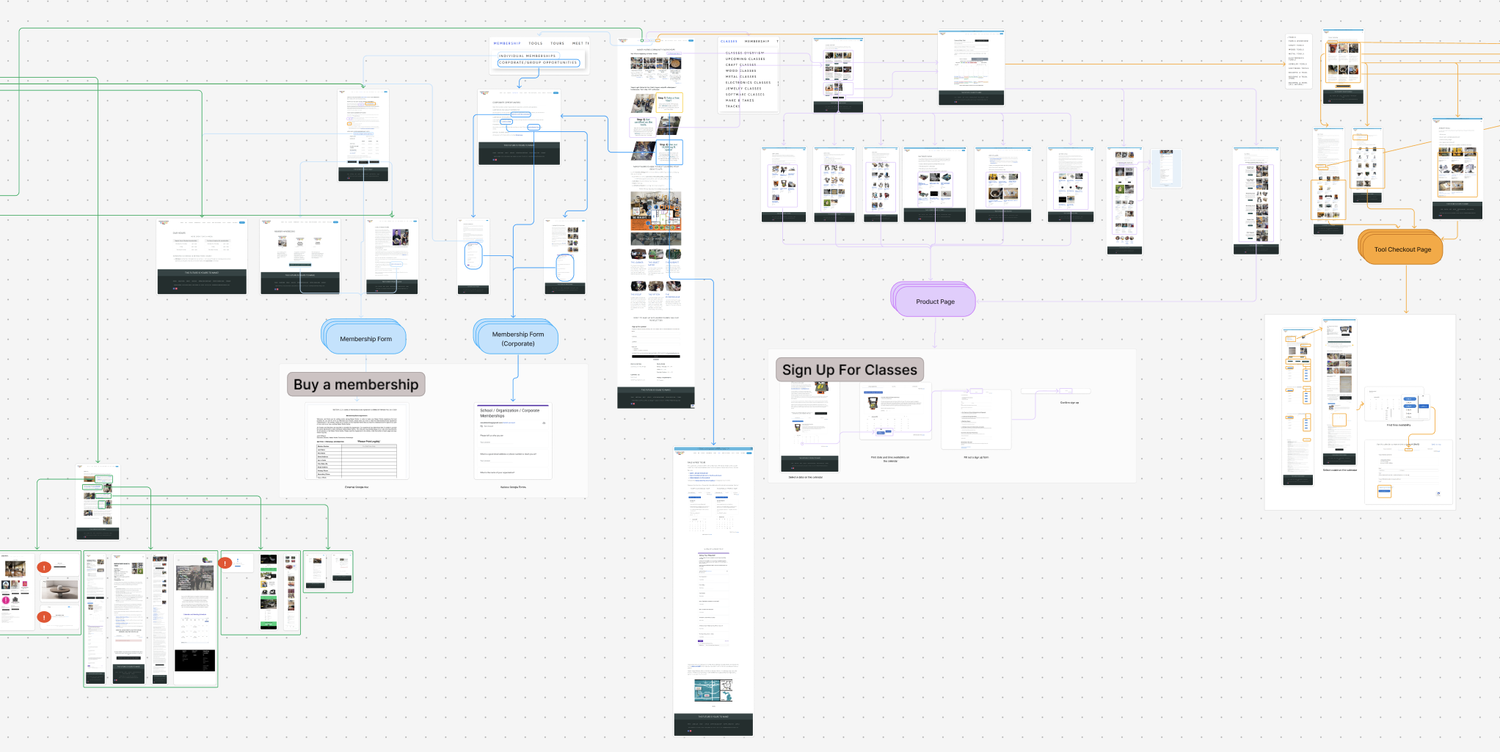
1. Research: Understanding Why People Weren’t Visiting
We used a multi-method approach that combined qualitative and evaluative techniques, so no single method could mislead us.
| User Interviews | Spoke with 3 existing members and 9 potential visitors |
|---|---|
| Interaction Mapping | Mapped key touchpoints on the website |
| Heuristic Evaluation | Assessed the homepage against established usability principles |
| Competitive Analysis | Studied similar maker spaces, community hubs and adjacent platforms |
| Usability Testing (Existing Site) | Created and conducted full end-to-end task-based, moderated user testing with 6 users |
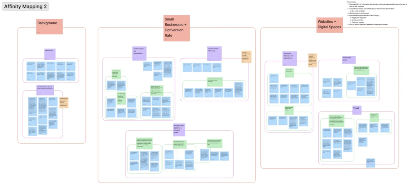
| Affinity Mapping | Facilitated synthesis sessions in FigJam |
2. The Key Insight
Maker Works offered real value, but the homepage didn't communicate it, didn't reduce uncertainty about visiting, and didn't guide anyone toward an in-person visit.
3. Design Principles
Research gave us four principles that guided every decision. We kept checking them against user tests, client meetings and internal reviews, and refined them as we learned.
1. Lead with clear value. Visitors should immediately understand what they gain from coming in.
2. Reduce ambiguity. Uncertainty is a barrier to showing up in person, so remove it.
3. Make the next step obvious. Strong, visible calls to action are essential for conversion.
4. Show, don't just tell. Social proof and visual context build trust and motivation.
4. Ideation and Iteration
I guided the team through structured ideation and iteration cycles focused on affinity mapping while keeping the work aligned with client goals.
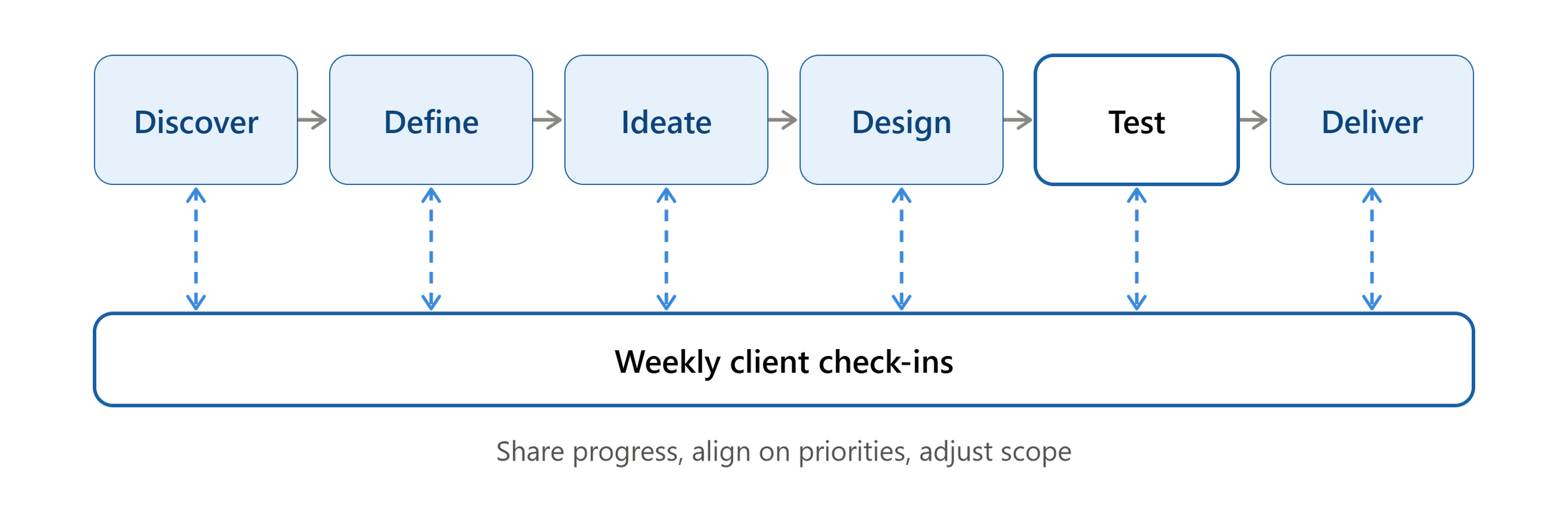
5. Managing the Project and the Client
I led weekly client meetings where we presented progress, shared research findings, and talked through priorities and trade-offs. This structure:
Kept user needs and stakeholder goals aligned
Sped up decisions
Gave us a clear picture of the client's resources and limits
Held scope within the timeframe
Built stakeholder feedback into every iteration
The Solution
Every change we made traces back to a friction point from research.
| Before | After | |
|---|---|---|
| Messaging | Unclear value proposition | Clear, compelling headline that says what you gain |
| Hierarchy | Unclear; nothing guided attention | Strong visual hierarchy that leads the eye |
| Calls to action | Weak or ambiguous | Prominent, specific CTAs |
| Layout | Cluttered and confusing | Simplified and intuitive |
| Content | Little sense of the real space | Rich imagery of the physical environment and community |
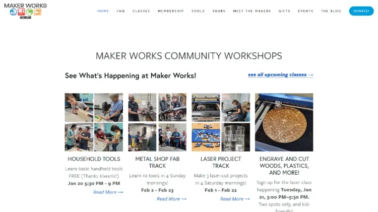
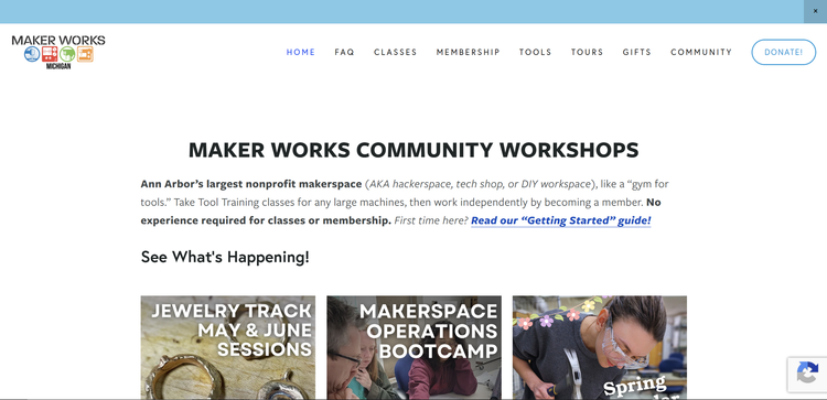
Note: Though research and redesign suggestions were made during the duration of our 3 month timeframe, the final implementation was done by 2 members of the team during their subsequent 4 month internship.
Impact
By aligning user needs with business goals, the redesign:
Clarified Offerings - Trimmed redundant or otherwise opaque links and images.
Reduced cognitive load for first-time visitors via addition by subtraction.
Built a stronger emotional connection to the space.
Encouraged the Next Step - Clear CTAs leading to greater user engagement with the website
Reflection
What I learned:
Know the client's constraints. Understanding their resources and limits led to recommendations they could act on, not a wish list of unfeasible features. Initially, we’d scoped for a full, bottom-up redesign, but the client’s limited resources and our limited time with the client meant we needed to scope down to reach our client’s desired results while still remaining within the bounds of feasibility.
Talk to stakeholders directly and often. Direct communication sped up iteration and decisions.
Tailor your communication. Framing findings in terms that resonate with stakeholders is a skill in its own right. During the meeting post-heuristic evaluation of the website, part of our meeting was dedicated to pitching what a heuristic evaluation is, and why the task was so important to complete, given the client’s non-UX background.
Use more than one method. A multi-method approach gave a fuller picture of user behavior than any single technique would have.
What I'd do next
A/B test the new CTA
Follow up with new visitors on what brought them in