Makerworks UX Overhaul
As both a UX researcher and project manager, I led a small cross-functional team in reimagining the digital experience for a local maker space. The primary objective was to increase the conversion rate between online homepage visitors and in-person visits to the physical location.
In addition to conducting research and contributing to design, I was responsible for coordinating team efforts, managing deadlines for deliverables, facilitating weekly client meetings, and ensuring alignment across stakeholders throughout the project lifecycle.
The Problem
How might we design a digital experience that not only informs users about the maker space, but also motivates them to take action and visit in person?
Research Methodology
To understand the problem space, I led and participated in a multi-method research approach that combined both qualitative and evaluative techniques:
User Interviews: We spoke directly with both existing members and potential visitors to understand motivations, barriers, and expectations.
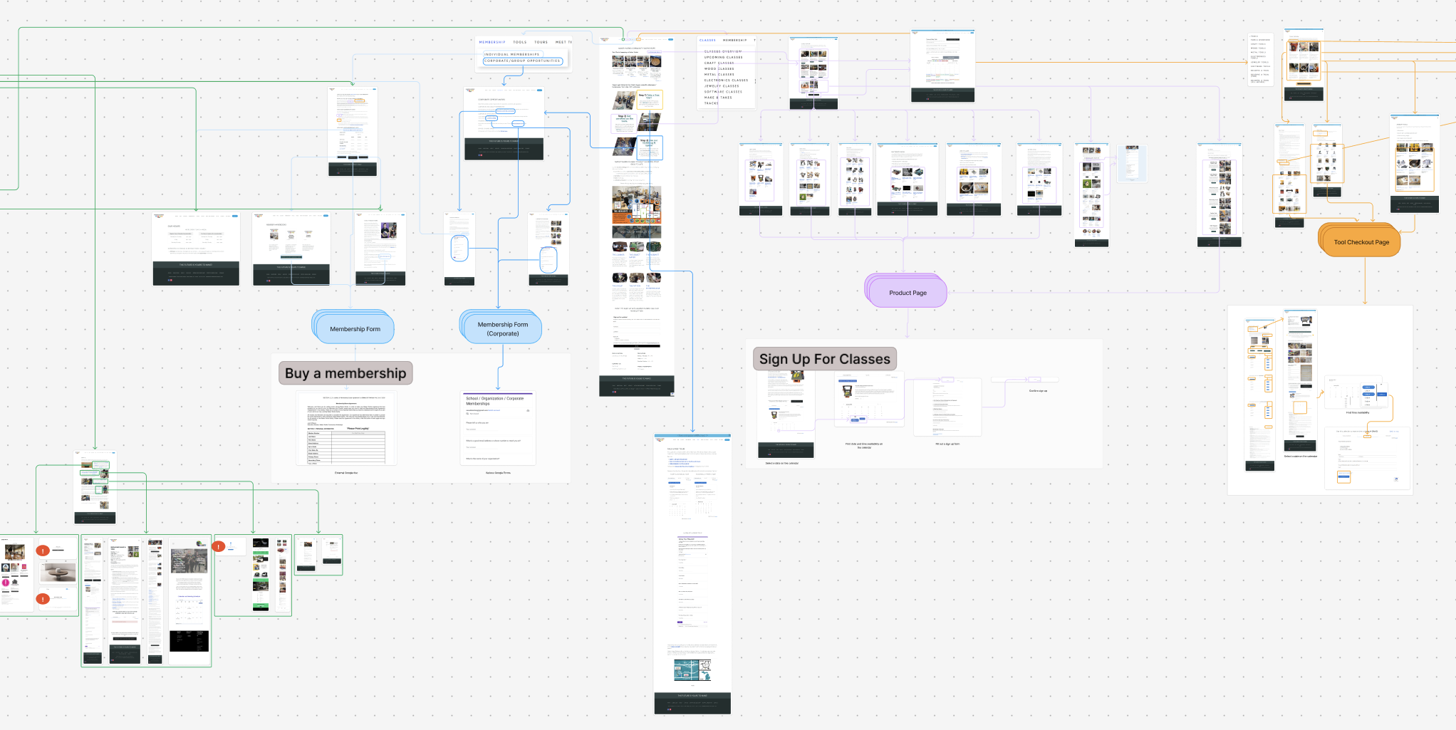
Interaction Mapping: We mapped out the key points of interaction on the website to gain a better understanding of intended user flow and which pain points we could identify
Heuristic Evaluation: We assessed the current homepage against established usability principles to identify friction points and missed opportunities.
Competitive Analysis: We analyzed similar maker spaces, community hubs, and adjacent platforms to understand how others drive physical engagement.
User Testing: Early observations of users interacting with the existing homepage revealed confusion around offerings, unclear calls-to-action, and a lack of compelling reasons to visit.
Affinity Boards: I facilitated collaborative synthesis sessions using Figma, helping the team organize insights, identify patterns, and align on key opportunity areas.
Through this research, we uncovered a critical insight: while the maker space offered valuable resources, the homepage failed to clearly communicate value, reduce uncertainty, or guide users toward an in-person visit.
Guiding Insights
Insights from research informed our design direction. As both a researcher and project manager, I helped guide the team through structured ideation and iteration cycles while maintaining alignment with client goals.
Key principles that shaped our approach:
Users need clear value propositions and immediate understanding of what they gain from visiting
Reducing ambiguity lowers the barrier to physical engagement
Strong, visible calls-to-action are essential for conversion
Social proof and visual context increase trust and motivation
These guiding insights were not static from the beginning—we continuously validated our ideas through user testing, client meetings, and internal reviews.


Stakeholder Collaboration
I facilitated and led weekly meetings with the client, where my team and I presented progress, synthesized research findings, and guided discussions around priorities and trade-offs.
These sessions ensured:
Continuous alignment between user needs and stakeholder goals
Faster decision-making through structured communication
Greater understanding of our client’s resources and limitations
Tightening of scope within a set timeframe
Incorporation of stakeholder feedback into each iteration
Balancing my dual role allowed me to bridge execution and strategy, ensuring that both the team and client stayed aligned throughout the process. This balance also put me in a unique position in which I had both a bird’s-eye-view as well as an on-the-ground perspective of the feasibility of deadlines, and how best to chunk out deliverables.
Before and After: Homepage Redesign
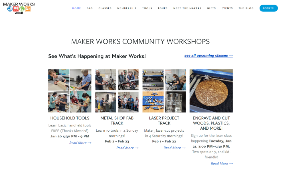
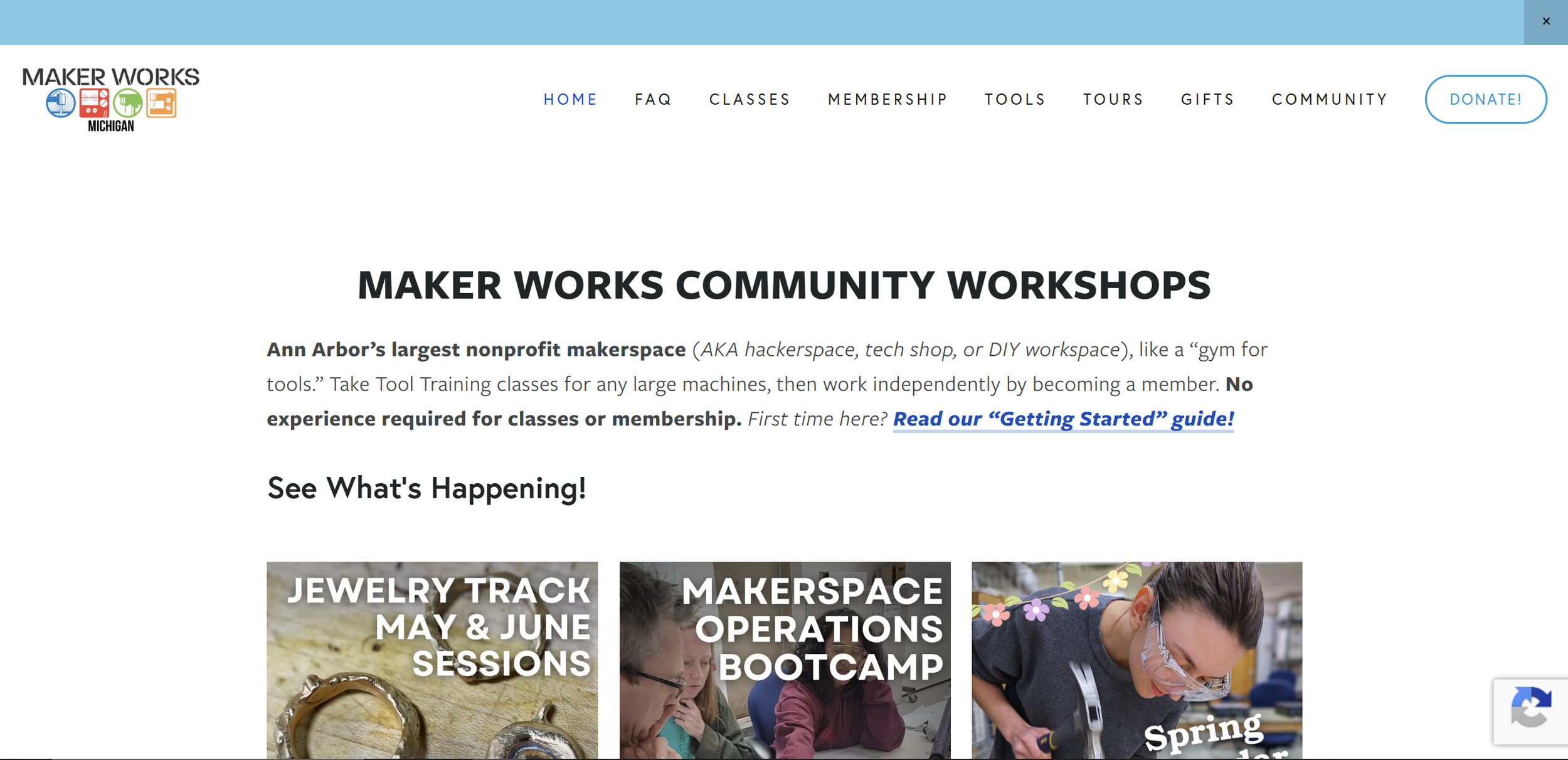
As part of the case study, I included visual comparisons of the homepage before and after our redesign to highlight key improvements:
Before:
Unclear messaging and value proposition
Unclear visual hierarchy
Weak or ambiguous calls-to-action
Visually-cluttered and confusing layout
After:
Clear, compelling headline communicating value
Strong visual hierarchy guiding user attention
Simplified, more intuitive visual layout
Rich imagery and content showcasing the physical environment and community
These changes directly addressed the friction points identified during research.
Outcomes
By aligning user needs with business objectives, the final solution:
Improved clarity of offerings
Reduced cognitive load for first-time visitors
Created a stronger emotional and informational connection to the space
Encouraged more users to take the next step and visit in person
Key Takeaways
Understanding your client’s limitations and available resources is key to making actionable recommendations and changes, as opposed to making “wish-lists” of unfeasible features
Direct stakeholder communication accelerates iteration and decision-making
It is important to understand how to communicate with stakeholders in a way which resonates with them
Multi-method research provides a more holistic understanding of user behavior